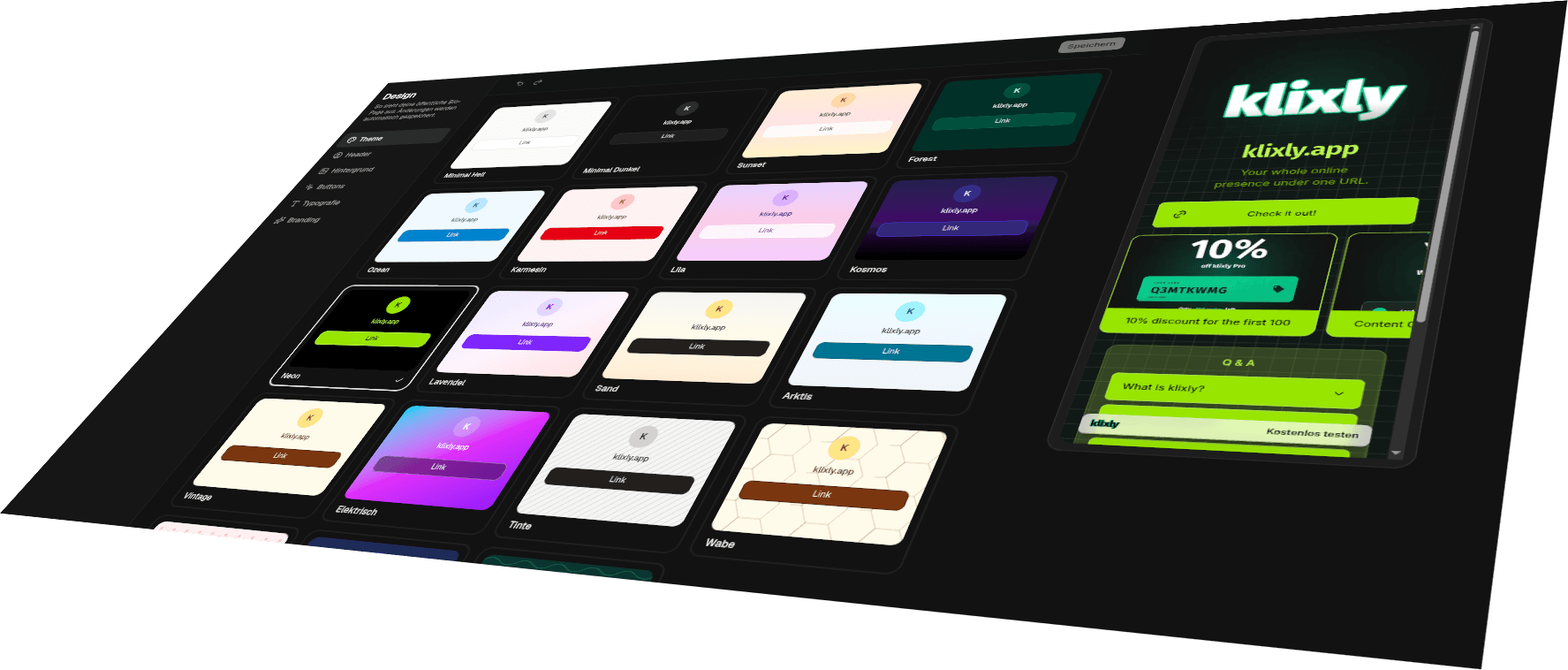
What a theme actually sets
A theme here isn't a colour filter but a coherent set: page background, text colour, the muted tone for descriptions and hints, the ring behind your avatar, and three matching button variants: solid, glass and outline. You pick a preset and the page is fully styled without you choosing a single colour yourself.
There are 19 presets in total, 7 of them on the free plan. They're built to differ rather than to be recolourings of one another: calm flat surfaces, soft gradients, deep dark tones and patterned backgrounds cover four fundamentally different moods.
A theme is never a one-way street either. Everything that follows, meaning background, type, button shape and layout, overrides the preset piece by piece. So you can start from a finished look and change only the two things that bother you.
Flat surfaces, gradients, dark tones, patterns
The calm presets, namely Minimal Light, Minimal Dark, Ocean, Crimson and Vintage, rest on a single muted surface. They hold back and let images, embeds and product shots carry the page; for portfolios and shops they're usually the safe choice.
The gradient themes blend two or three colours into each other: Sunset runs from orange through rose to amber, Sand from warm stone to peach, Arctic from cyan through blue to cool grey, while Lavender and Lilac stay in the violet-fuchsia range. The gradient spans the full page height, so the page shifts tone as you scroll without becoming restless. Electric takes the same route with far louder colours, namely cyan, fuchsia and violet, and suits music and event pages more than business cards.
The dark presets aren't plain black surfaces; each carries its own cast: Forest a deep woodland green, Cosmic a gradient from indigo through violet into black, Blueprint a technical deep blue, Topo a dark teal. Neon provides the hardest contrast of all: pure black with lime-green type.
Five presets come with a pattern: Honeycomb lays a hexagon grid over warm cream, Polka fine dots over rosé, Ink a restrained grid over light stone, Blueprint a drafting grid over deep blue, and Topo contour lines over teal. The pattern isn't an image but an SVG whose line colour is derived from the brightness of the surface beneath it, which is why it stays legible even if you swap the background colour later.
Your brand colours instead of preset colours
With Pro you leave the preset behind and set five colours yourself: page background, heading, body text, button surface and button text. You enter hex values and they apply immediately, and the preset classes stay underneath as a fallback, so nothing breaks when you clear a colour again.
If you don't know your brand colour by heart, just upload your logo: the logo picker reads the dominant colours out of the image and offers them as a palette. Your page hits the right tone without you hunting for hex values in a design tool.
Background: surface, gradient, pattern or your own image
Independently of the theme you can set the background four ways: a single flat colour, a gradient you mix between two colours, one of 7 patterns (dots, grid, waves, lines, noise, hexagon or camo) or an image of your own.
The patterns aren't shipped as finished graphics; they're generated at runtime in the colour you want. klixly picks the line tone automatically from the brightness of your surface, so the pattern stays visible on light and dark backgrounds alike without competing with the text.
The background image is a Pro feature. It's stored through our own upload path rather than loaded from an external URL, so your bio page never makes requests to third-party servers for it.
23 typefaces, from neutral to handwritten
The free plan includes 3 typefaces: Inter, DM Sans and Geist, three neutral grotesques that make any page look clean. Pro adds 20 more, sorted by character.
Sans: Space Grotesk, Poppins and Fira Sans. Serif: Fraunces, Playfair Display, Lora and DM Serif Display, for authors, editorial work and anything that should feel printed. Monospace: IBM Plex Mono and JetBrains Mono, the technical option for developer profiles.
Handwritten and casual: Caveat, Patrick Hand, Comic Neue and Indie Flower. Flowing scripts: Pacifico, Dancing Script, Great Vibes and Lobster. And for loud headlines the display faces Bebas Neue, Permanent Marker and Monoton.
Pro also lets you set the size of your link labels across four steps. That helps when your link texts run long, or when you deliberately want the page to read quieter.
Buttons: shape, edge, shadow and motion
Links come in 3 basic shapes: solid for maximum clarity, glass for the translucent look over gradients and images, outline for the most restrained variant. On top of that: 4 corner radii from slightly rounded to a full pill, and 4 shadow steps, from none through soft to the hard offset shadow that gives a page its poster-like note.
With Pro, individual links can also move: six understated animations, namely bounce, jello, wobble, pulse, shake and tada, run at calm intervals and draw the eye to the one link that matters right now. Anyone who has reduced motion enabled in their system never sees them at all.
Header, title and arrangement
The header comes in two variants: classic, with a round avatar above name and description, or spotlight, where a large image fills the top of the page and the name and text sit over it. The spotlight header is part of Pro, as is using your logo instead of your name as the page title.
The links themselves are arranged either as a classic vertical list or as a grid: a tile layout where individual entries may be twice as wide or tall and images work as surfaces, closer to a magazine spread than to a list of links. The grid layout is a Pro feature; the list is available on every plan.
Everything visible as you set it
The design editor is split into seven areas: theme, header, background, buttons, layout, typography and branding. A live preview sits in a phone frame permanently beside it. Every change appears there the moment you make it; you don't have to save anything to see how it lands.
The phone frame isn't decoration: bio pages are opened mostly on phones, out of an app. So the preview defaults to mobile, and every theme, type and button decision gets judged at that width first.
What the free plan covers, and where Pro is needed
Free includes 7 themes, 3 typefaces, every button shape, corner radius and shadow step, backgrounds as surface, gradient or pattern, and the list layout. That's enough to build a page that looks complete and tidy. None of it is a trial version with a watermark.
Pro unlocks the remaining 12 themes, 20 additional typefaces, custom colours, the background image, the spotlight header, your logo as the page title, link label sizing, link animations, the grid layout, and hiding the klixly note in the page footer.